I lost track of how many times I ripped back my Moroccan Tile Afghan before I finally figured out the pattern. It's not that it's hard (once I got it down), but I found the edges tricky (until I got it solidly in my head how they are to be handled). They are handled differently depending on whether you're working a "grout" row as opposed to a "tile" row, and then they are handled differently depending on where the tiles land (each row has the dots staggered from the row below). Then add to that, I decided to do my color changes differently than the pattern directed, and that changed how the edges are done all over again. The video tutorial was immensely helpful, but it did take watching it a couple of times before I nailed the edges. And even now, I have to concentrate a bit as I approach them (though it gets better and better with each row).
I know I'm probably causing someone to be hesitant about giving this pattern a go, but let me encourage you... it really isn't a difficult pattern. And the video tutorial makes it a great pattern.
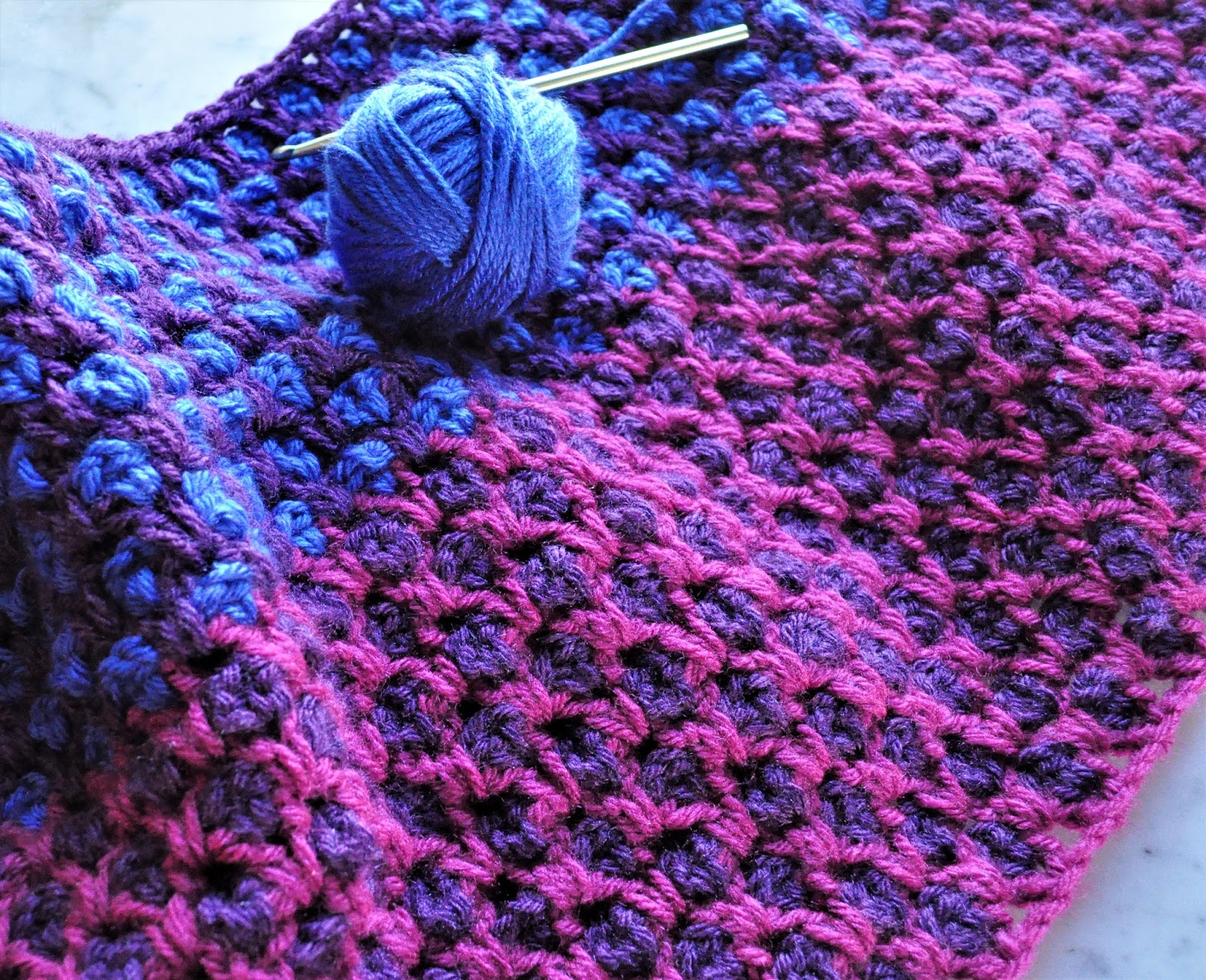
Here's a picture today after I transitioned to the second set of colors:
It's going to be so fun watching the colors change on this as it grows.
The next project that saw a number of do-overs were my first blocks in the 2017 BAM CAL on Ravelry. I thought I had figured out my colors finally and it would be smooth sailing.
Well... my idea of going "colorfully vintage" turned out to be a bust. Using Stylecraft Special DK yarn, I decided to start with some dusty pink and rose colors, gold, silver, and parchment. I found I was rather underwhelmed by the colors:

So I had a re-think about it all. For some reason I was stuck on wanting to use the parchment color (that's the dingy "off-white" color in the picture above), so I came up with a completely different color scheme using it:

Now, if I was making a blanket for a guy, this color scheme isn't exactly bad, but it doesn't excite me enough to spend a year making similarly colored blocks. Offering no inspiration, this square was a bust as well. But something interesting that I learned is that dark and bright colors kind of lift the parchment color from dingy to well... not so much. That is valuable to know - especially since I bought a bunch of skeins of this yarn.
At this point I didn't know what to do. But I did realize it was time for another re-think about colors. I love the idea of vintage, but I don't want "dingy". I also love the idea of something vibrant and colorful, but I'm not sure I'm ready to make something really raucous. What to do? What to do?
And then... a bit of serendipity happened. A book I had put on hold weeks ago at the library came in. The book is Modern Crochet Mandalas by the Editors of Interweave. It's a brand new book and I am the first one to check it out. I was so excited!

I knew inside the book were going to be some wonderful mandala patterns and was almost giddy as I started to flip through it. My brain needed a break from my crocheted blocks. And then something unexpected happened as I was browsing the pictures. It occurred to me that the beautiful color combinations that looked fascinating in the mandala patterns would surely look just as wonderful in a "granny" square type block. What a rich collection of pictures and patterns to peruse. Whether I make any of the mandalas or not, the pictures were very helpful to me in seeing color combinations I hadn't thought of before. The hardest part was narrowing down and figuring out what colors I could pull from my stash to replicate some of the combinations.
I decided to give these colors a try:


So... I love the idea of vintage, but I don't want "dingy". I want colorful, but raucous kind of scares me. I tend to be pretty predictable and yet I want something completely unpredictable in this blanket. This is tough. And I had no idea I could be so fickle!
I'm not sure what I'm going to end up with as my color palette for my year's worth of blanket squares, but I'm not giving up easily. I have some more ideas brewing, but for now I think I need to give it a rest.
I hope it's not a year spent just trying out different combinations of colors, but you know... there could be worse things. While I have a rudimentary understanding of color theory, I could certainly use some real practice putting color combinations together. The end result could end up being a raucous looking blanket after all. And something about that kinda makes me smile - even if a little nervously.
Hmmm... that smile may be a clue how to proceed... Tune in here, I guess, to see what I come up with next! :)
To see what other Yoppers are up to click on the graphic below to go to our group on Ravelry.

I love all the trials of colors....not they may not be what you like...but you are working through a process. I went to a workshop with Kathy Merrick, the designer of the famous Babette blanket...and she had us pull colors and put colors together they we didn't think went together and other activities...it was quite enlightening, although I do still tend to stick to certain colors...
ReplyDeleteOooh... That workshop sounds interesting and I can only imagine how enlightening it was. I looked up the Babette blanket and YES! Something like that is what I think I want my BAM CAL blanket to look like. I've pulled together some other yarns and interesting colors, so we'll if I like better my second (or will it be third - wait a minute, I think it will be my fifth!) go-around of making some squares. ;^)
DeleteIt's quite fun to see all your different tries. I'll admit I like the very first combination- I find it quite convincingly vintage looking. And your reorganization of the colours with the dark red border is very fresh looking. But you're right, that might be too much when combined in square after square. It's so safe and easy over here on my solid coloured sock island :)
ReplyDeletelol. I'm a pretty safe crocheter. I think that's why I'm wanting to stretch myself here with this BAM CAL. It seems like the perfect opportunity.
DeleteI love the vintage look - and the book looks awesome. You are going to convert me to crocheting!
ReplyDelete;^) I'd like nothing more than to entice you over to the hooky side of yarn. lol
DeleteThe mandalas look fun to hook. LOVE your afghan project. You are doing well. For me it takes me a bit to adjust to crochet and reading and figuring out the pattern. I'm glad you got it figured out and can move onwards.
ReplyDeleteThanks, Stefanie!
DeleteHi Becki, I find all the squares are lovely, sometimes, it helps the overall design of the afghan to have a duller or plainer square scattered randomly, seems to make the whole thing sizzle. So dont frog the first one, it may just come in handy!
ReplyDeleteBut I have to say the last two are my favourites.
Good point that I'll keep in mind, Sharon. I do find it difficult to imagine actually putting together whole blanket of squares - especially dissimilar ones. But seeing is believing and I've seen some beauties on Ravelry that have convinced me that some of the most disparate squares can work together.
DeleteI really liked the first one but I am vintage and dusty and muted through and through. When I first found Lucy at Attic 24 I was all over the colors but quickly tired of the brights and have now realized that I like color but more muted shades. I will tell you that I used parchment in my Maybelle squares blanket but with white also and that really makes the parchment stand out. Your last square is quite beautiful and maybe you should just combine them all to make a scrapghan! LOL! The book is a great find and especially for color combos.
ReplyDeleteThe Morrocan Tile Afghan is gorgeous and I printed it off but who am I kidding? I just have too many irons in the fire right now but I am loving yours!
LOL to your first sentence. I love you, Sam. :) I checked out your Maybelle squares. Beautiful! And yes, you're right - putting the parchment with the white changes it completely. I knew bright (and maybe even some dark) colors lifted the parchment to something more attractive, but that white combined with it is stunning. Thank you for pointing that out! Something to think about...
DeleteI see 3 squares that would look fantastic together. O ce they are laid side by side, the dusty vintage one will oerk up. The manly square is the only one I don't think would fit in. But why not make a manly afghan too?
ReplyDeleteWhy not make a manly afghan, too? 'Cuz I just don't wanna. lol Okay... I just tried your idea. I put the dusty vintage one in between the two bright squares and it did help it. Not enough to make me like it, but you're right. It did perk up a bit. It will need to try harder to win me over, though. ;^)
DeleteLove the afghan: love the first square; ADORE the second to last square and love the last. Good luck to you is all I can say!
ReplyDeleteI quite liked the first square, but I love your experiments and agree, the last ones are better. I also love the blue, but perhaps that's my monitor. Looking forward to seeing what you end up with.
ReplyDeleteHi Becki, thank you for visiting my blog and taking the time to comment. I too agonise over colour choices. This year it is easy for me using variegated yarn. Your squares look great. I particularly love the pink and green ones I do have a penchant for pink and green...
ReplyDelete