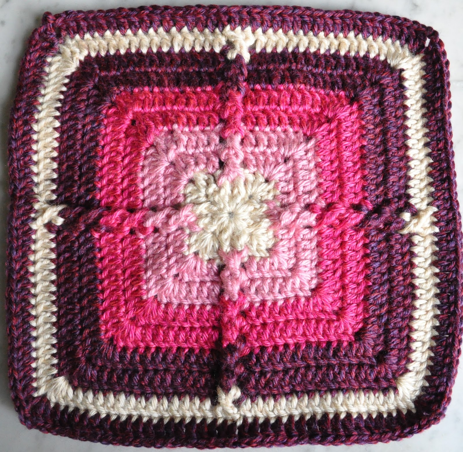
I finally got around to steam blocking my Sage Advice square. And, as I seem to do every time I make a new square, I've separated out the squares I've made into two categories, and have another think over this project.
Those made with a blue-based solid color construction:


My original thought (what was it, in 2017?) was I would combine all of these squares into the same blanket. But the more I look at all these squares together, and try to place them together, I'm wondering if I'll be happier if I just make two separate blankets.
Of course, the problem with that is that I will have to make twice as many squares as I would need to make for just one blanket, and it would take at least twice as long to finish all of this "square" business.
On the other hand, if I make two blankets, I will use up more yarn in my stash - which, let's not forget, is one of my goals.
While I work out what I want to do, I'll be alternating making squares with blue and purple as the base color. At some point, I'll either become more sure of making two blankets, or I'll reach the point of having enough squares for one blanket and decide I'm just ready to be done with the the whole project and combine them all together.

Have I mentioned before how I always seem to overthink a project?
And, for some reason, make things harder than they need to be?
It's like it's in my DNA or something...